
Healthcare organizations need content marketing, too.
Fluctuating laws, stringent regulations, and extensive legal reviews that scrutinize how companies get their messages across can make things difficult, but that hasn’t stopped healthcare businesses from trying. Up to 83 percent of healthcare companies use content marketing as part of their strategy and 14 percent more plan to start engaging with it this year.
A great way to engage customers, patients, and other businesses is to up your data visualization game. Besides, healthcare organizations have access to expert information and studies nobody else has. Why not leverage that exclusive information and share those insights by visualizing it with superior chart design?
The benefits are clear. Readers prefer visuals to go with their information; according to HubSpot, if a relevant image is paired with text, people will retain 65 percent of the information days later. In fact, click on that HubSpot link and check out the visuals—charts aplenty. Healthcare content marketers can leverage charts and data visualization for greater engagement as well.
You probably remember chart types from school, right? In case you don’t here’s a quick refresher with a few pro tips:
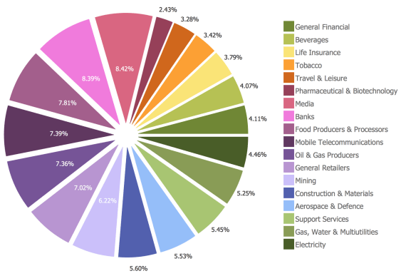
Pie charts: The most visually pleasing, these are used to represent the portions of a whole. So, if you have a lot of data about one subject (such as brands of medication that patients prefer), the pie chart would be a good chart design choice. The largest portion of data should start at the 12 o’-clock position and continue to the right. Don’t fill up the chart with too many slices or you run the risk of confusing the viewer.
Line charts: The perfect chart for visualizing data that changes over time. These can highlight trends, highs, lows, and are great for telling success (or failure) stories. However, these charts can lead to confusion or misrepresentation of data depending on a variety of factors, including increment size (use simple ones such as tens or hundreds), too many overlapping lines and labels (don’t use too many), and the data chosen for the x- and y-axis values.

This series of line charts that detail Britain’s eating habits over the last 50 years is a perfect example of excellent line chart design because the staggering amount of data displayed is so surprisingly clear (sauces and mayos were huge during Y2K). Just make sure the line chart tells the story you want to get across.
Vertical bar graphs: These signify proportional quantities (for example, pharmaceutical use by country), and they’re usually quite reliable so long as they’re easy to read (leave some space between bars) and don’t misrepresent any data (start the baseline at zero). You can even fancy them up by adding extra data points such as percentages, by adding grid lines, or by coloring in the bars. Simple and effective.

Horizontal bar graphs: An even simpler version of vertical bar graphs, these compare categories of data by ordering data sets/bars from largest to smallest. Simply label bars, color them, and let the visuals do the talking.

Basically, you want to keep the chart designs simple, organize the data clearly, and don’t forget the call-to-action.
All the above charts can be incorporated into various other types of content, too, including infographics. This infographic from Healthdata.org about healthcare spending in the United States combines vertical bar graphs, horizontal bar graphs, pie charts, and some extremely colorful line charts to paint a pretty clear (and expensive) picture of healthcare costs in America. A well-designed infographics can merge useful data with eye-popping icons, colors, and visuals to attract and engage viewers more than a simple, static pie chart can.
And you don’t have to just use still images. Video is an important part of content marketing too, and chart design can be incorporated into animation or motion graphics as well. If you have a chart that you use to explain a compelling set of data (like a serious condition, side effects, or medication costs), consider a video version that gets across that information in a more dynamic way.
Good chart design, whether it’s a standalone chart, part of an infographic, or an animated video can help your healthcare data get in front who you want to see it.
Ready to scale your healthcare organization’s content marketing? Contact us to see how we can help.